
Your dream clients are out there, searching for the perfect photographer. But what if your website is actually turning them away instead of booking them? The truth is, many photographers make simple website mistakes that cost them inquiries and clients. If your site isn’t making a great first impression, loading quickly, or guiding visitors to book, you might be losing potential business without even realizing it.
In this post, we’re diving into 5 website mistakes photographers make that could be driving your dream clients away—and how to fix them so your site works for you, not against you.
1. Your “Above the Fold” is a Snoozefest
(Aka: You Have 7 Seconds to Make an Impression—Don’t Waste Them!)
When someone lands on your site, what do they see first? If the top of your homepage (a.k.a. the “above the fold” section) is vague, cluttered, or just plain boring, visitors will peace out before they even scroll.
Think about it: if they don’t instantly know who you are, what you do, and who you do it for, why would they stick around?
The Fix:
✔ Clear, bold messaging. Your headline should scream exactly what you do and who you do it for.
✔ A compelling call to action. Tell visitors exactly what to do next—whether it’s booking a call, browsing your portfolio, or downloading your pricing guide.
✔ A stunning, high-impact image. This should be your best work, not just a generic landscape shot.
✔ Clear Navigation (Top of Page) A sticky menu keeps key pages visible, making navigation effortless. A CTA button (like “Inquire”) in the top-right corner ensures easy action.
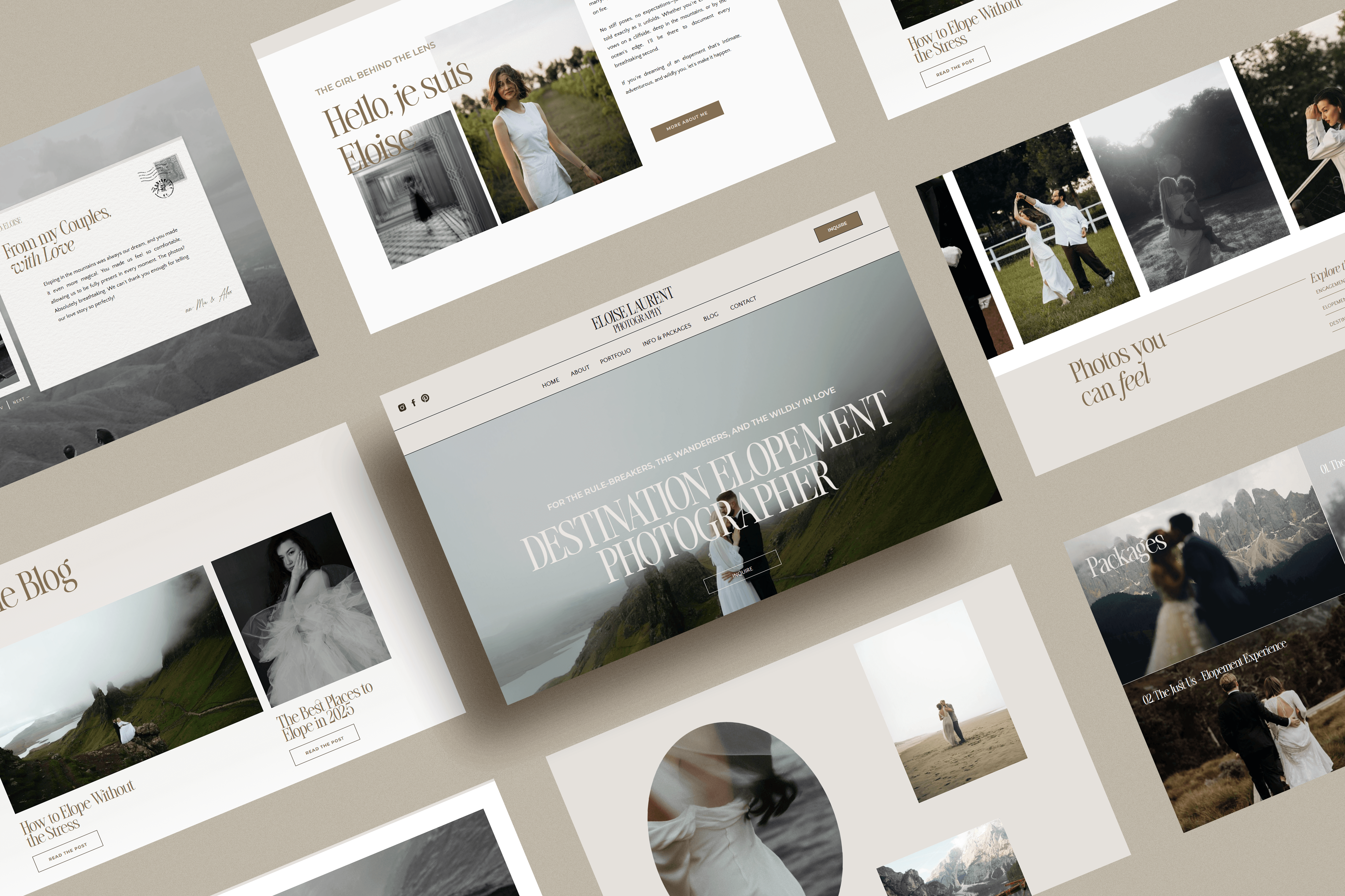
Visual Breakdown: The Perfect “Above the Fold” Section
Now, instead of just telling you what makes an above-the-fold section work, let’s see it in action. Below is an example of a high-converting homepage layout, with every element placed strategically to capture attention and keep visitors engaged.
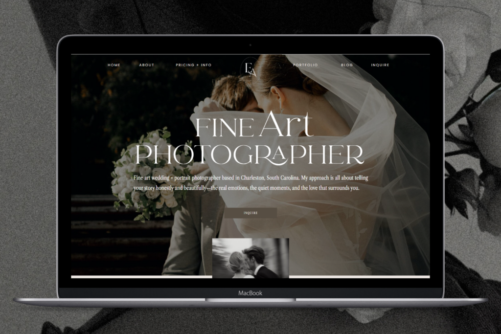
What Makes This “Above the Fold” Chef’s Kiss Perfection?
📍 Navigation Bar (Top of Page)
✔ A sticky menu ensures visitors always have access to key pages.
✔ Clear, concise menu items (Home, Portfolio, About, Services, Blog, Contact) eliminate confusion.
✔ A call-to-action (CTA) button (“Inquire” or “Book Now”) in the top-right corner makes it effortless to take action.
📍 Header: “FINE ART PHOTOGRAPHY”
✔ Instantly communicates what kind of photography you specialize in—no guessing needed.
📍 Subheading: “Fine art wedding + portrait photographer based in Charleston, South Carolina.”
✔ Who you are + what you do + where you’re located in one sentence. This lets visitors know immediately if they’re in the right place.
📍 Approach Statement: “My approach is all about telling your story honestly and beautifully—the real emotions, the quiet moments, and the love that surrounds you.”
✔ Creates an emotional connection. This isn’t just photography—it’s storytelling.
📍 CTA Button: “Inquire”
✔ Provides a clear next step. No need to search—visitors know exactly how to move forward.
2. Your Site is a Speed Trap
(Slow Load Times = Lost Clients)
If your website takes longer to load than it does to microwave a burrito, you’re in trouble. 40% of users will abandon a site that takes more than 3 seconds to load. That’s almost half your potential clients—GONE.
Think about your dream client—they’re excited, scrolling through photographer websites, ready to book. But if your site is lagging, stalling, or taking forever to load, they’re clicking that back button real quick and heading straight to your competitor.
🔻 Why This Happens:
✔ Massive, unoptimized images slowing down your site
✔ Too many unnecessary plugins or scripts hogging bandwidth
✔ Slow website hosting that can’t handle your traffic
✅ The Fix:
✔ Compress your images. Uploading full-resolution files? Resize and optimize them for the web using tools like TinyJPG or JPEGmini.
✔ Ditch the extras. Remove unused plugins, scripts, and anything slowing your site down.
✔ Upgrade your hosting. If your site is crawling, your hosting provider might be the issue. Invest in fast, reliable hosting for a seamless experience.
📌 Pro Tip: Use Google PageSpeed Insights to test your website speed and get recommendations for improvement.
If your website isn’t fast, it’s losing you clients. A high-performing site = a high-converting site. Speed it up, and watch those inquiries roll in!
3. If Clients Can’t Find What They Need, They’re Not Booking
(If Visitors Have to Work Too Hard, They’ll Just Leave.)
Imagine walking into a boutique looking for the perfect outfit. But instead of neatly organized sections, there are racks everywhere, no labels, and the checkout counter is nowhere in sight. Frustrating, right?
That’s exactly how visitors feel when your website navigation is confusing. They don’t have time to dig for your pricing, portfolio, or contact page. If they can’t instantly figure out where to go, they’ll just go somewhere else (aka, your competitor’s website).
🚨 The Red Flags:
✔ Your menu has too many options (Do you really need 10+ items?)
✔ Page titles are too vague (“Details” instead of “Investment” or “Pricing”)
✔ There’s no clear next step guiding them to inquire
🛠 The Fix:
✔ Simplify your menu. Stick to 4-6 core items (Home, Portfolio, About, Services, Blog, Contact).
✔ Label things clearly. Clients aren’t mind readers—make sure they instantly understand where to click.
✔ Lead them to the inquiry. Your “Book Now” or “Inquire” button should be front and center, preferably in your top navigation.
📌 Pro Tip: Ask a friend (who isn’t a photographer) to find your pricing in under 5 seconds. If they struggle, your visitors are struggling too.
A great website feels effortless—no confusion, no frustration, just a smooth experience that naturally leads to booking you.
4.Your Website Copy is Putting People to Sleep
(Boring, Generic, or Confusing Copy = No Bookings.)
You could have the most stunning portfolio ever, but if your website copy is bland, robotic, or all about you (instead of your client), people won’t feel connected—and they definitely won’t book.
🚨 The Red Flags:
✔ Your homepage reads like: “Hi, I’m [Your Name]. I’ve been a photographer for 10 years. I love coffee and my dog.” (Cool, but why should they care?)
✔ Your about page sounds like a résumé instead of a story that connects
✔ Your service page is missing the WHY—why should they book YOU over anyone else?
🛠 The Fix:
✔ Talk to your dream client. Instead of “I’m passionate about photography”, say “You deserve wedding photos that feel like a dream—timeless, emotional, and uniquely yours.”
✔ Ditch the fluff, get to the point. Visitors skim—make your words count.
✔ Write like a human. No stiff, formal language. Imagine explaining your business to a friend over coffee.
📌 Pro Tip: Your website copy isn’t about YOU—it’s about how YOU can help THEM.
Great copy makes people feel something. When potential clients feel seen, understood, and excited, they’ll stop browsing and start booking.
5. No Clear Next Steps = No Bookings
(If You Don’t Tell Them What to Do, They Won’t Do It.)
So your dream client lands on your site, loves your work, and thinks, “Wow, I want them to photograph my wedding!” … but then what?
If your website doesn’t clearly guide them to book, they’ll hesitate. And hesitation leads to lost inquiries.
🚨 The Red Flags:
✔ No obvious call-to-action (CTA) on your homepage (or worse—none at all!)
✔ Your contact form is hidden, confusing, or asks for way too much info
✔ There’s no clear explanation of what happens after they inquire
🛠 The Fix:
✔ Call-to-action buttons on every page. “Inquire Now,” “Book Your Session,” “Let’s Chat”—make it clear and clickable.
✔ Make your contact form easy. Ask just the essentials—too many fields = abandoned forms.
✔ Guide them through the process. Let them know what to expect next (“Once you inquire, I’ll respond within 24 hours with my pricing and availability!”).
📌 Pro Tip: Your CTA should be the easiest thing to find on your site—if they have to search for it, you’ve already lost them.
A website that guides visitors seamlessly from admiration to action? That’s a website that books clients.
Final Thoughts: Your Website Should Be Your Best Salesperson
Your dream clients are out there, searching for a photographer just like you. But if your website is making any of these 5 costly mistakes, they might be clicking away before they ever get the chance to book you.
The good news? These are all fixable. With a few strategic tweaks—like improving your above-the-fold section, simplifying your navigation, speeding up your site, writing copy that connects, and making it stupid easy to inquire—you can turn your website into a client-booking machine.
And if this all feels overwhelming? I got you.
As a website designer for photographers, I specialize in creating Showit websites that don’t just look pretty—they actually convert. So whether you need a full custom design or a beautifully designed template that’s easy to customize, I can help you build a site that works for you, not against you.
📩 Ready to elevate your website and start booking more dream clients? Let’s chat!
Inquire about a custom website, website in a week